
Notion
User research was conducted on a new, yet widely successful productivity app in order to improve usability for it’s audience.
Duration: 7 weeks
Team: Natalie Codina and Lorenzo Losurdo
Methods: Heuristic evaluation, cognitive walkthrough, interviews, user personas, usability tests
Tools: Microsoft Word, Quicktime Player, Notion
Role: UX Researcher

Context
How can we improve Notion's usability to attract and retain users?
Notion offers customizable organization across devices, letting users build anything from lists to reports. However, this flexibility can be intimidating. User research helps us understand these needs and improve Notion's appeal and user loyalty.
Heuristic Evaluation and Cognitive Walkthrough
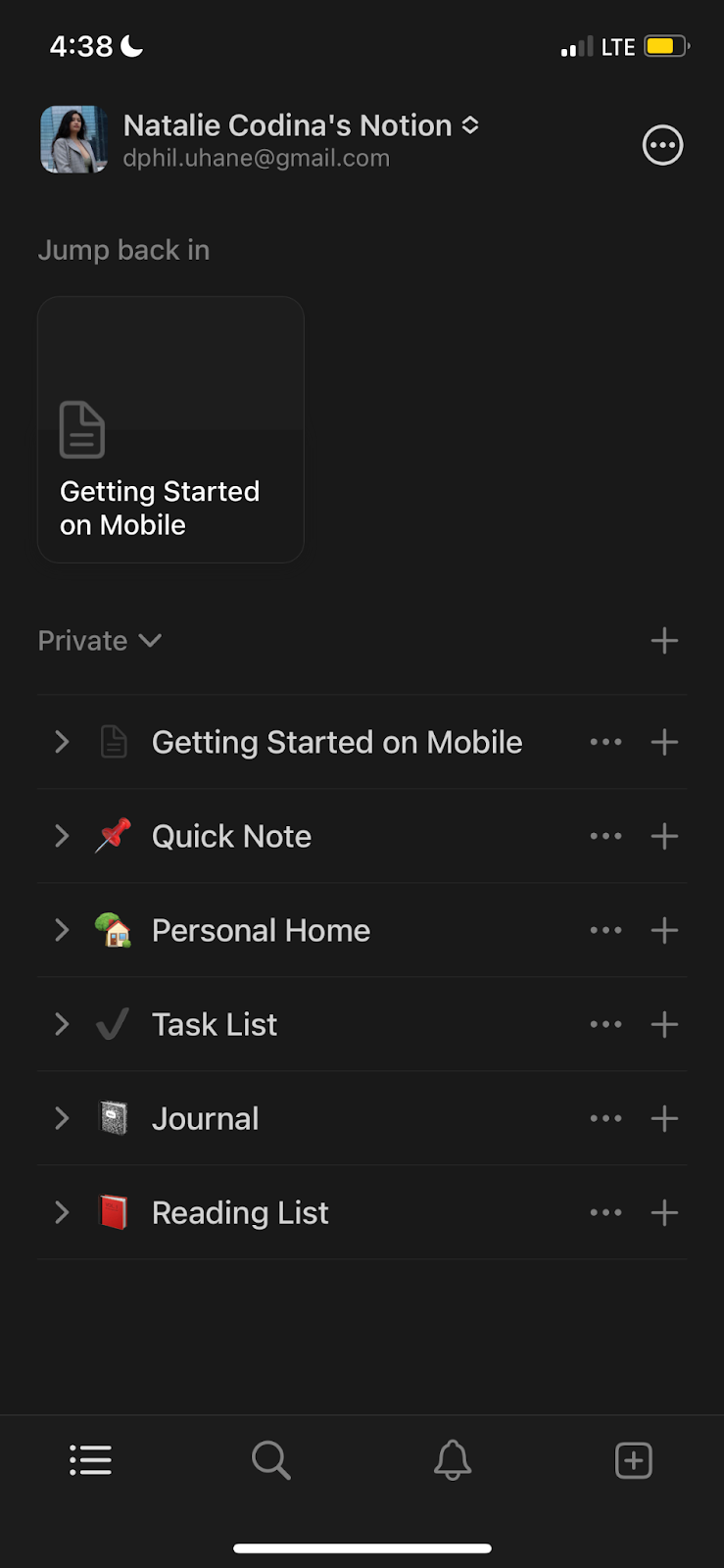
Notion's mobile app was evaluated using heuristic and cognitive walkthrough methods.

What we found:
Overall, Notion mobile had several major and significant usability issues
Notion's mobile app acts as a supplement to the desktop version. This limits users who primarily use mobile or prefer not to switch devices
Notion's mobile app, built for existing users, isn't beginner-friendly
With a lack of obvious undo buttons, it’s tough for new users to explore features without fear of mistakes
Our Recommendations:
Create a more extensive introduction for first-time users
Have an obvious undo button constantly present
Restructure the mobile interface and architecture to be more intuitive for users
Incorporate more features currently exclusive to the desktop application
I evaluated Notion's iOS app (heuristic & cognitive walkthrough) to understand usability issues. As a Notion user myself, I found the mobile app less intuitive than desktop and wanted to investigate.
Based on the results of our findings, we decided to go in a new direction.
Notion's mobile app suffers from usability problems for first-time users due to its reliance on the desktop experience. To prioritize effectively, we focused on strengthening the desktop app's foundation before tackling the mobile redesign.
User Interviews
User interviews were conducted to identify how potential Notion users organize their day-to-day tasks, and what they look for in their ideal productivity software
We interviewed college students (our target demographic according to traffic analysis) to understand their task management habits and ideal productivity software features. Beforehand, we piloted the interview script to ensure clarity and flow.
What did we find?
We identified three main archetypes through our assessments, in which we then created user personas for.

Tech-savvy, organized students who desire both productivity and visual appeal in their workflow
Archetype #1: The Aestheticist
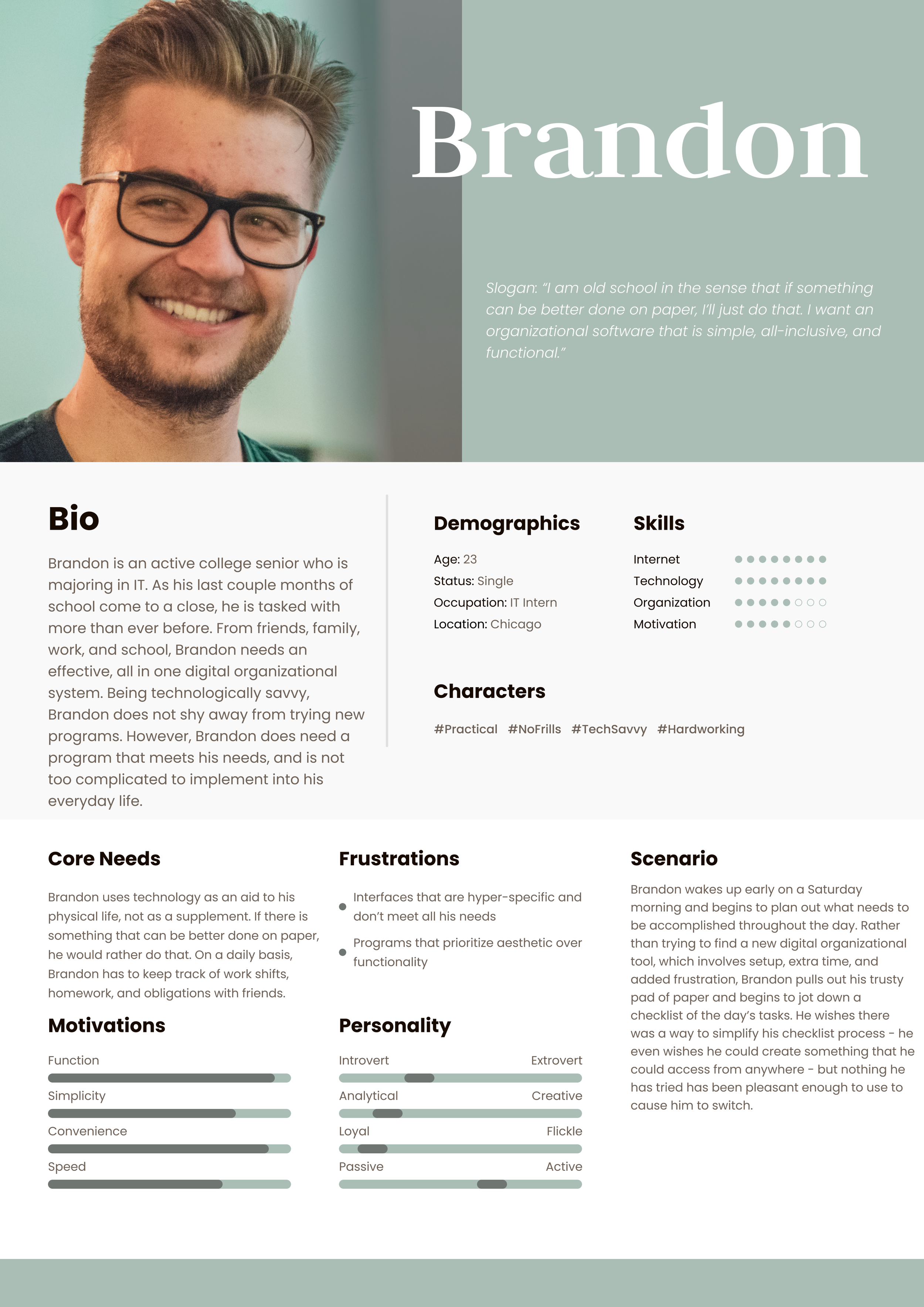
Prioritizes functionality and simplicity over fancy interfaces. They'll readily switch to pen and paper if software gets in their way
Archetype #2: The Pragmatic

Organized students who juggle digital tools with pen and paper to find the perfect productivity mix
Archetype #3: The Balanced Individual
User Testing
User testing was completed next to observe the strengths and weaknesses of Notion in real time.
For our user testing, we focused on potential Notion users, not existing ones. Notion prioritizes user-friendliness and customization, so gauging how first-time users with limited tech knowledge navigate the platform is key.
What did we find? What do we recommend?
Almost all users were not able to find the “/” function, which is where the majority of the main functions and features lie
User attention for all users were drawn to less important pages and functions first, rather than the most important ones.
Many users found the AI function confusing, and diverted their attention from main features
We first and foremost recommend more interactive tutorials for first-time users to mitigate issues of being unable to find essential functions

Reflection & Key Takeaways
Pretty visuals can't hide bad design - Notion attracts users with beautiful templates, but functionality is key for retaining them.
It takes lots of time and thought to create a good user interview script - Crafting the user interview script was an iterative process. We balanced finding the right questions with avoiding a cold,impersonal tone that could hinder rapport with interviewees
Professionalism and comfortability are both necessary in participant interaction - Striking a balance is key when interacting with participants. Professionalism ensures respect, but can feel cold. Injecting some casualness builds rapport without compromising the interview's integrity